A man surfing
Two men greeting with hand

Case Study 3

Case Study 3

Designing a Simpler Path to Early Financial Freedom

Overview

Overview

Overview

Lead UX Designer | Platform: Consumer Mobile App | Domain: Banking & Analytics

This case study is about making financial planning feel doable. Retire Early turns everyday data into a simple score and small, guided actions. The result: users feel informed, motivated, and finally in control of their future.

This case study is about making financial planning feel doable. Retire Early turns everyday data into a simple score and small, guided actions. The result: users feel informed, motivated, and finally in control of their future.

This case study is about making financial planning feel doable. Retire Early turns everyday data into a simple score and small, guided actions. The result: users feel informed, motivated, and finally in control of their future.

Group of men standing with Sufboard

My Role

My Role

My Role

The part I played

As Lead UI/UX Designer, I shaped the experience from early concept to pilot launch blending research, product strategy, and UX craft into one clear direction.

As Lead UI/UX Designer, I shaped the experience from early concept to pilot launch blending research, product strategy, and UX craft into one clear direction.

As Lead UI/UX Designer, I shaped the experience from early concept to pilot launch blending research, product strategy, and UX craft into one clear direction.

My responsibilities included:

  • Studying how early savers think and behave, then shaping the IA and the Retire Early Score around those insights.

  • Studying how early savers think and behave, then shaping the IA and the Retire Early Score around those insights.

  • Designing the full experience flows, prototypes, and dashboards with clarity and long-term engagement at the core.

  • Designing the full experience flows, prototypes, and dashboards with clarity and long-term engagement at the core.

  • Partnering with data science and engineering to ensure numerical transparency and keep the product aligned across teams.

  • Partnering with data science and engineering to ensure numerical transparency and keep the product aligned across teams.

  1. Key Challange

Starting From Zero, Building What Matters

Starting From Zero, Building What Matters

Challenges

Challenges

Challenges

Designing Without a Template

Designing Without a Template

Retire Early wasn’t an iteration of an existing app there was nothing to inherit, no flow to refine, and no benchmark except what users wished existed. With no pre-existing patterns to lean on, every decision score logic, actions, content tone, even iconography needed to be invented from the ground up.

Retire Early wasn’t an iteration of an existing app there was nothing to inherit, no flow to refine, and no benchmark except what users wished existed. With no pre-existing patterns to lean on, every decision score logic, actions, content tone, even iconography needed to be invented from the ground up.

Balancing Math With Motivation

Balancing Math With Motivation

Financial products crave precision. Human behaviour needs compassion. Designing something accurate and emotionally supportive meant collaborating closely with data science while refusing to let formulas overshadow usability or momentum.

Financial products crave precision. Human behaviour needs compassion. Designing something accurate and emotionally supportive meant collaborating closely with data science while refusing to let formulas overshadow usability or momentum.

Solutions

Solutions

Solutions

A Behavior-Driven Discovery Track

To guide the build, I introduced a discovery track rooted in behavioural research and iterative validation. Instead of starting with features, we began with habits and emotions—then shaped product mechanics around what keeps users consistent. We tested first principles (clarity, reward, small steps), then layered functionality only when it supported those principles.

To guide the build, I introduced a discovery track rooted in behavioural research and iterative validation. Instead of starting with features, we began with habits and emotions then shaped product mechanics around what keeps users consistent. We tested first principles (clarity, reward, small steps), then layered functionality only when it supported those principles.

To guide the build, I introduced a discovery track rooted in behavioural research and iterative validation. Instead of starting with features, we began with habits and emotions—then shaped product mechanics around what keeps users consistent. We tested first principles (clarity, reward, small steps), then layered functionality only when it supported those principles.

Key Features of our Process

Key Features of our Process

  • Behavior-First Exploration: We validated habits before we designed features.

  • Data Co-Design: Score logic and UX evolved together, not sequentially.

  • Lean, Testable Artifacts: Everything from content tone to challenge mechanics was prototyped and tested before committing to build.

  • Principled Prioritisation: Features were added only if they supported clarity, motivation, and small wins.

A man surfing
A man surfing
A man surfing

2. Design Discovery

Instead of jumping straight into features, we started by untangling how people actually deal with money. Our affinity mapping helped us strip away assumptions and focus on the few behaviours that truly influence financial progress.

Instead of jumping straight into features, we started by untangling how people actually deal with money. Our affinity mapping helped us strip away assumptions and focus on the few behaviours that truly influence financial progress.

This sprint wasn’t about building more. It was about removing noise, simplifying decisions, and defining what “financial progress” should feel like for everyday users.

This sprint wasn’t about building more. It was about removing noise, simplifying decisions, and defining what “financial progress” should feel like for everyday users.

A man surfing
A man surfing
A man surfing

UX Outcome

UX Outcome

Business case validation across desirability, feasibility, and behavioural impact.

Business case validation across desirability, feasibility, and behavioural impact.

Clear insights, hypotheses, and UX strategy rooted in real user habits (not financial theory).

Clear insights, hypotheses, and UX strategy rooted in real user habits (not financial theory).

Early design directions exploring how progress could be shown, understood, and acted on.

Early design directions exploring how progress could be shown, understood, and acted on.

Key Insights from Research

Key Insights from Research

People juggle multiple payment apps for “backup”

Users don’t trust a single system. They keep many apps and cards active just in case one fails. Trust, not tools, is the problem. Retire Early must feel reliable from day one.

Missing payment dates causes anxiety

People fear penalties more than debt itself.
Stress is driven by uncertainty, not lack of money.

Emergency Planning is rare

Financial thinking is reactive, not proactive. Progress needs to feel short-term and achievable, not distant.

Savings strategies are learnt from influencers, friends, and relatives

People follow “50-30-20” or random hacks without knowing if it fits their reality.Retire Early must translate personal data into personalised rules.

Hypotheses

Hypotheses

Busy lives kill momentum.

Busy lives kill momentum.

People don’t avoid finance because it’s hard they avoid it because it takes time. Micro-tasks under two minutes could keep them engaged.

Clarity beats knowledge

Users don’t want lessons; they want direction.
Turning data into one clear next step could drive action faster than education.

Tiny wins build habits

Motivation burns out, but progress compounds.
Small challenges and streak-driven rewards could build lasting behaviour.

Automation earns trust

Manual effort creates doubt and drop-offs. Transparent auto-categorisation and goal suggestions could reduce effort and strengthen confidence.

Spending is emotional

Money decisions happen in moods, not spreadsheets.
Right-time nudges could help users pause before impulsive spending.

Automation earns trust

Manual effort creates doubt and drop-offs.

UX Strategy

UX Strategy

Make Money Effortless

Autocategorization, one-tap goal setup, default savings suggestions, pre-filled actions. Let the app do the heavy lifting so saving feels automatic, not aspirational.

Teach Without Textbooks

Use bite-sized guidance in context quick tips during actions, spending insights with a “what this means” twist, and interactive challenges that teach by doing, not reading.

Turn Goals Into Daily Wins

The Retire Early Score becomes a progress meter, with streaks, micro-milestones, celebratory feedback, and savings “levels” that make long-term planning feel like leveling up, not waiting forever.

Replace Guilt With Smart Framing

Re-frame insights as wins: “Save ₹150 this week by swapping delivery twice.” Surfacing consequences as gains nudges users toward action without shame.

  1. Develop

Designing a System Around Real People

This stage wasn’t about screens yet; it was about how the product should think. We first grounded the experience in real people, then shaped a system that supports the way they actually make decisions. Personas showed us how busy professionals handle money on the move, and the architecture translated those behaviours into a guided journey. Together, they set the rule for Retire Early: remove effort, remove uncertainty, and let progress happen in small, steady steps.

Designing for Real Financial Behaviours, Not Ideal Users

Designing for Real Financial
Behaviours, Not Ideal Users

Designing for Real
Financial Behaviours,
Not Ideal Users

Once the product structure was defined, we shaped it around the people most likely to rely on it. Retire Early isn’t for finance experts it’s for busy professionals who want progress without extra learning or jargon.
The architecture only matters if it fits into real lives that are already packed and unpredictable.

Personas like John, a time-pressed electrician, and Sara, an office assistant juggling payments kept our decisions grounded. They don’t want financial theory; they want clarity and small wins they can actually maintain. Designing for their habits made the product direction obvious: reduce effort, remove uncertainty, and make saving feel doable one step at a time.

A man surfing
A man surfing
A man surfing

Structuring Progress Before Designing Screens

Structuring Progress Before Designing Screens

We mapped the product’s architecture first, not the UI. The goal wasn’t to arrange pages it was to turn saving into a guided system. Every connection in this map answers one question: what’s the next move for the user, and how do we make it effortless? Goals link to contributions, insights trigger actions, and challenges reinforce habits. By designing the system before the interface, we ensured Retire Early nudges progress by logic, not luck.

Group of men standing with Sufboard
  1. Deliver

Designing a Life You Can Retire Into

At a glance

At a glance

Retire Early helps people work toward financial freedom without letting money take over their lives.
The experience focuses on clarity, momentum, and controlshowing users where they stand, what to do next, and how everyday decisions move them closer to retiring early.

Progress is designed to feel visible and rewarding, using gentle cues and small wins to keep users engaged over time.
The goal is simple: build consistency, reduce anxiety, and make long-term financial growth feel motivating not overwhelming.

Key Feature

Key Feature

  • Retire Early Score : A single metric that shows how close users are to financial independence.

  • Retire Early Score : A single metric that shows how close users are to financial independence.

  • All Finances, One View : Accounts, spending, savings, and investments brought together clearly.

  • Actionable Money Insights : Personalised insights that turn data into simple next steps.

  • Habit-Building Challenges : Small challenges and streaks that keep progress moving without overwhelm.

  • Conversational Guidance : Plain-language help to explore decisions, scenarios, and trade-offs.

Group of men standing with Sufboard

Home

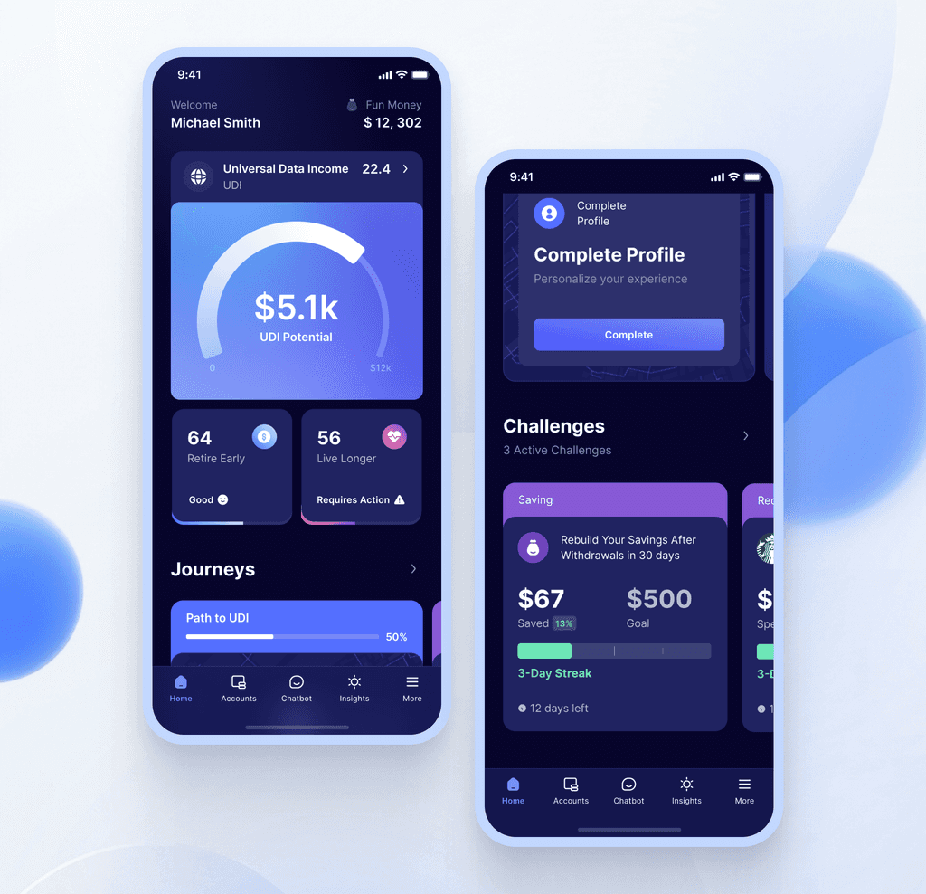
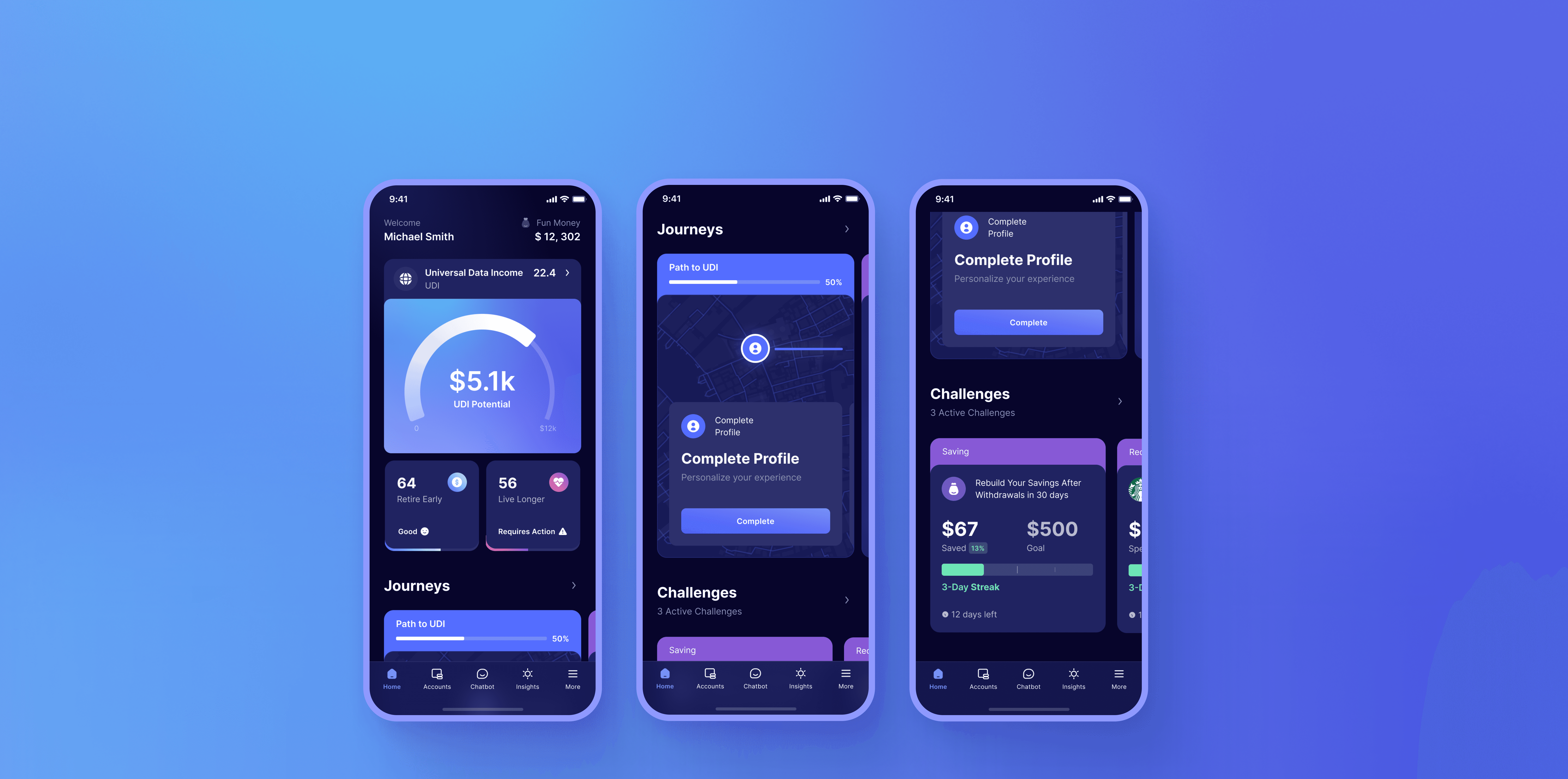
The home screen answers one question instantly: Where do I stand right now? It gives users a calm, focused view of their financial position and the next best move replacing noise with clarity and turning long-term goals into something they can work on today.

Anti Pattern Used

We avoid static dashboards and data dumps. Information appears progressively, using simple status cues to keep attention on what matters most.

UX Psychology Applied

Goal Gradient makes progress feel real. Choice Architecture reduces decision fatigue by ranking actions by impact. The experience stays motivating without becoming overwhelming.

Challenges

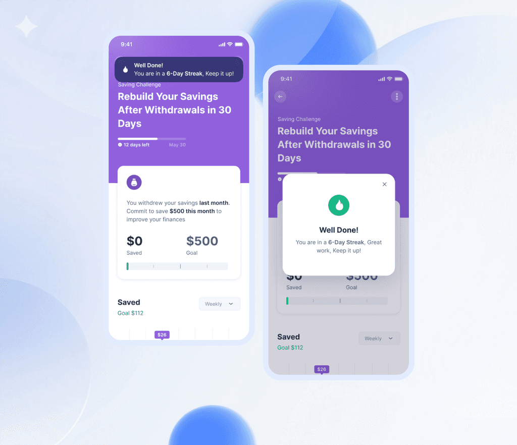
Challenges turn long-term financial goals into short, winnable missions. Instead of abstract advice, users commit to concrete actions like “Rebuild Your Savings in 30 Days,” with visible progress, streaks, and gentle celebration along the way. It makes saving feel achievable, not overwhelming.

Anti-Patterns Used

We avoid motivation through pressure. Progress is revealed gradually, and feedback stays encouraging. Even when users fall behind, the system nudges instead of shaming.

UX Psychology Applied

Goal Gradient and Habit Formation work together here: small wins, visible progress, and streaks keep momentum high. Soft Loss Aversion appears through subtle reminders of what’s at risk, while positive reinforcement keeps the emotional tone optimistic and sustainable.

Anti-Patterns Used

We avoid static dashboards and data dumps. Information appears progressively, using simple status cues to keep attention on what matters most.

UX Psychology Applied

Goal Gradient makes progress feel real. Choice Architecture reduces decision fatigue by ranking actions by impact. The experience stays motivating without becoming overwhelming.

Challenges

Challenges

Challenges turn long-term financial goals into short, winnable missions. Instead of abstract advice, users commit to concrete actions like “Rebuild Your Savings in 30 Days,” with visible progress, streaks, and gentle celebration along the way. It makes saving feel achievable, not overwhelming.

Challenges turn long-term financial goals into short, winnable missions. Instead of abstract advice, users commit to concrete actions like “Rebuild Your Savings in 30 Days,” with visible progress, streaks, and gentle celebration along the way. It makes saving feel achievable, not overwhelming.

Anti-Patterns Used

We avoid motivation through pressure. Progress is revealed gradually, and feedback stays encouraging. Even when users fall behind, the system nudges instead of shaming.

We avoid motivation through pressure. Progress is revealed gradually, and feedback stays encouraging. Even when users fall behind, the system nudges instead of shaming.

UX Psychology Applied

Goal Gradient and Habit Formation work together here: small wins, visible progress, and streaks keep momentum high. Soft Loss Aversion appears through subtle reminders of what’s at risk, while positive reinforcement keeps the emotional tone optimistic and sustainable.

Goal Gradient and Habit Formation work together here: small wins, visible progress, and streaks keep momentum high. Soft Loss Aversion appears through subtle reminders of what’s at risk, while positive reinforcement keeps the emotional tone optimistic and sustainable.

Group of men standing with Sufboard

Chatbot

The chatbot acts as the user’s financial co-pilot. It removes the need to hunt for answers, translating complex money questions into simple conversations and immediate next steps right when the user needs them.

Anti Pattern Used

We avoid help-center mazes and static FAQs. Instead of forcing users to search, the system brings clarity to the surface through suggested questions and conversational shortcuts.

UX Psychology Applied

Cognitive Load Reduction keeps decisions light. Progressive Disclosure reveals only what’s relevant in the moment. The result feels supportive, fast, and human not like talking to a spreadsheet.

Challenges

Challenges turn long-term financial goals into short, winnable missions. Instead of abstract advice, users commit to concrete actions like “Rebuild Your Savings in 30 Days,” with visible progress, streaks, and gentle celebration along the way. It makes saving feel achievable, not overwhelming.

Anti-Patterns Used

We avoid motivation through pressure. Progress is revealed gradually, and feedback stays encouraging. Even when users fall behind, the system nudges instead of shaming.

UX Psychology Applied

Goal Gradient and Habit Formation work together here: small wins, visible progress, and streaks keep momentum high. Soft Loss Aversion appears through subtle reminders of what’s at risk, while positive reinforcement keeps the emotional tone optimistic and sustainable.

Impact

Impact

Impact

Results That Spoke for Themselves

  • Helped users move from financial confusion to clear next steps within minutes of onboarding

  • Increased weekly engagement through challenges, streaks, and progress feedback

  • Reduced anxiety around money by replacing complex planning with simple, guided actions

  • Improved saving consistency by turning long-term goals into short, repeatable habits

  • Strengthened trust in personal finances through transparent scores, previews, and progress indicators

Lessons Learned

Lessons Learned

Lessons Learned

Winning Moments

  • Proved that behavioral design can outperform traditional financial tools

  • Built a system where motivation and structure reinforce each other

  • Created a product users return to not because they have to but because it feels good to use

Lessons Learned

  • Clarity beats motivation — when the next step is obvious, users move without hesitation

  • Small wins build big change — micro-progress keeps long-term goals alive

  • Emotion matters in finance — calm design reduces fear and increases follow-through

  • Good UX doesn’t just inform — it reshapes financial behavior
Victory symbol
Victory symbol

Hello.

Hello, I’m Bhagyashree. I learned design through curiosity that wouldn’t rest, mistakes that taught quickly, and iteration that never stopped. I’ve always been drawn not to the surface, but to the systems and logic beneath it.

I’m now looking for something exciting to work on feel free to contact me.

Let's Connect

Hello.

Hello, I’m Bhagyashree. I learned design through curiosity that wouldn’t rest, mistakes that taught quickly, and iteration that never stopped. I’ve always been drawn not to the surface, but to the systems and logic beneath it.

I’m now looking for something exciting to work on. Feel free to contact me.